In 2012, kind of as a "resolution", I decided I would either try to make my handwriting neater and more consistent
or create a font of my handwriting. (I think my handwriting is fairly neat, but it swaps which direction it's leaning or how close to cursive it is or what percentage of each word devolves into a scribble.) With one day remaining this year, I did the latter and figured out how to make my own font.
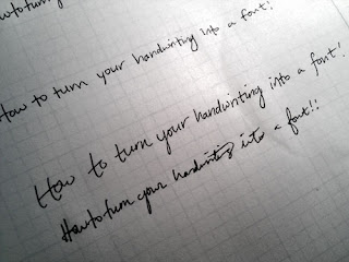 |
| Real handwriting with pen on paper. |
 |
| Digitized handwriting! |
Resources
This
tutorial from the Wired wiki gave me a clue as to what software to use and has some information about scanning and tracing your letters if you write them with pen on paper.
I also had some trouble figuring out how to make my lowercase letters be the right size, but
Chank's tutorial, which looks to be about 15 years old yet is still highly relevant, gave me some clues.
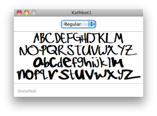 |
| In which all the letters are unintentionally the same size... |
Tools
- Wacom Bamboo tablet (mine looks like this, but I think this is the current model)
- Adobe Illustrator
- Fontlab's Fontographer 5
Step 1: Draw some letters in Illustrator
Illustrator and I are pretty good friends. Better than me and Photoshop, anyway. It allows me to make some pretty nice drawings and diagrams. I use the brush tool and set it to "2 pt oval". It feels like a fat felt-tip pen. Unlike the pencil tool, it doesn't try to connect with and smooth out other brush strokes, because it deselects the stroke after you draw it. If you actively select an existing brush stroke (hold command, then click on the stroke) you can re-stroke an existing stroke.
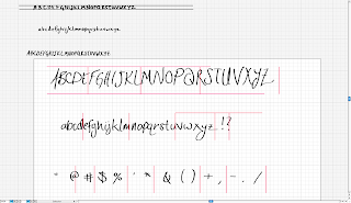 |
| Alphabet in Illustrator |
Step 2: Get those letters into Fontographer
It's super easy to select a letter in Illustrator, copy it, and then paste it into the appropriate letter in Fontographer. The problem is that it will scale your letter to fit the whole space it allocated for that letter. (There are mysterious lines and margins, but I didn't figure them out.)
The trick I learned from Chank's tutorial was to use some dummy geometry to keep your letter height consistent. That's what all those pink lines are. The height of the dummy geometry should go from the highest point to the lowest point in your entire alphabet.
 |
| Copying the letter "A" and the dummy pink vertical line. |
 |
| Pasting the "A" with vertical line into the font program. |
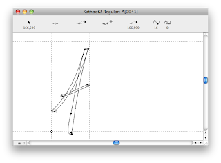 |
| Selecting and deleting the vertical line! |
Step 3: Test out your new font!
To get a live preview of your font, go to
Window > Open Metrics Window and type some stuff.
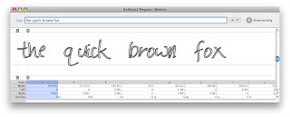 |
| I don't know why it's just showing the outline. It wasn't doing that earlier. |
Step 4: Muck with the kerning and spacing
I don't know too much about typography. I know making it look good has to do with the spacing between letters and sometimes the spacing between particular pairs of letters.
In the Metrics window, you can click on letters and drag around their left/right spacing and the kerning thing.
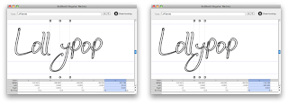 |
| Fixing the "y" to slide underneath other letters. |
Step 5: Admire and install!
Before creating your final font files, go to
Element > Font Info... and give your font a good name. I discovered that it doesn't like having numbers in the name.
Even though copying each letter into the font was kind of tedious, now I'm done and can write a blog post about it! You can
download my font here if you are interested.
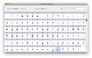 |
| Font in Fontographer |
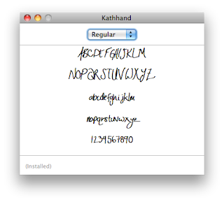 |
| Font preview in Font Book |
Installing, at least on a mac, is pretty easy. Just open the font in the Font Book app, and it will let you install it. Then you can use it in other programs... maybe! My new font works in some programs, but not Powerpoint, which maybe requires fancier export settings.
Now that I know how, maybe I'll make more fonts in the future! Ones that capture specific moods or are designed for certain aesthetics.


This comment has been removed by the author.
ReplyDeleteOkay this blogspot thing and commenting is very confusing.
ReplyDeleteAnyway, what I said is "This is very cool!"
Thanks, Dan!
ReplyDeleteI agree that the blogspot commenting system leaves something to be desired.
Try disqus.com
ReplyDeleteNice post btw!
Hello,
ReplyDeleteYour post is really look cool and containing a very interesting things.
Thanks for Post.
Regards
Handwriting
I love your handwriting! I have been wanting to turn my handwriting into a font, but I don't have a tablet or money to buy one. Instead I'm just downloading all the free fonts I can get my hands on.
ReplyDeleteThanks! Hope those free fonts are working out!
DeleteIt's unfortunate that each step costs money unless you find a way around it. There's a free version of one of the tools that might work: use Inkscape instead of Illustrator. Also, drawing the letters on paper, scanning (e.g. at a school library) or taking a photo, and then tracing them by hand (or just drawing them by hand) in a vector drawing program (like Inkscape) could get your pretty far.
ReplyDeleteThank you! Canva revolutionised my work. I work as a PR & marketing manager in hospitality and I don’t have a big marketing budget, so Canva is perfect for me. 1$ for picture is not so much but I can create some nice offers for our clients. Here you have an example of my work: http://www.dwor.pl/pl/klienci_biznesowi/spotkania_wigilijne/ and it was only for 2 $ It’s a nice alternative for Shutterstock etc. Fonts are beautiful, it is very creative thinking to learn how to mix them. I use it also on my personal blog